Case study
Policy as Code (PacBot)
Transforming cloud compliance through simplified workflows and efficient navigation.
- Organization
- T-Mobile
- Role
- Senior Product Designer
- Team
- Visual & Interaction Design Lead, Program Manager / Frontend Lead, UX Director
- Year
- 2020–2021
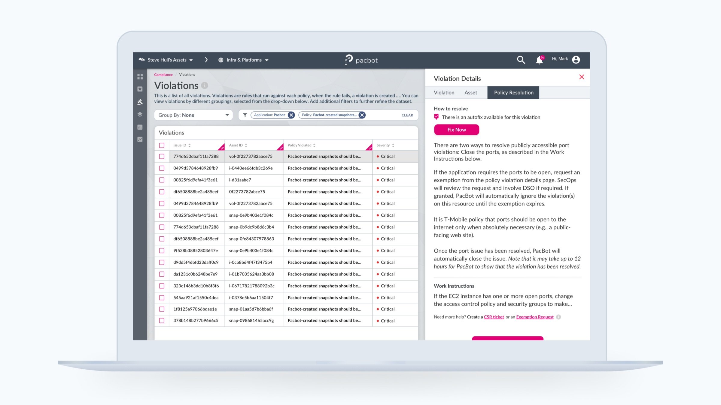
Summary
T-Mobile’s cloud compliance platform, PacBot, faced challenges in user experience due to its complex navigation and overloaded information. A study aimed to simplify workflows and enhance user engagement revealed the necessity of better navigational paths, information management, and application performance.
Through streamlining violation metadata, introducing a right-click function, and redesigning the violations page to present upfront information, we enhanced the user experience significantly. Post-redesign, violation page views dropped by 50% and visits to the policy details page increased by 7%. The project highlighted the importance of user behavior analysis and the potential of minor UI adjustments in improving enterprise products.
What is PacBot?
PacBot is T-Mobile’s open-source cloud compliance platform. Policies for compliance and security are implemented as code. In PacBot, violations occur when the assets discovered by the system fail to meet the compliance criteria of the policies.
Challenge
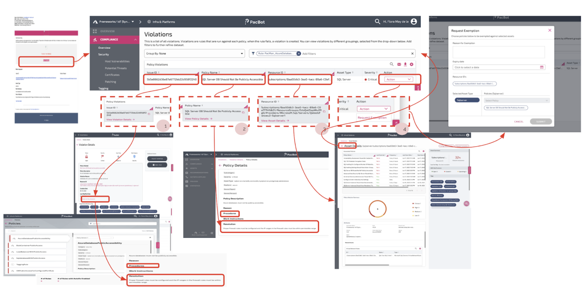 A messy path from Violations page to How-to Resolutions
When PacBot was first launched in 2017, the application provided detailed compliance reporting. As it matured and became the single source of truth for cloud users in T-Mobile, the need for an action-oriented platform became evident. In three years, more and more applications migrated to the cloud, and PacBot became an integral part of T-Mobile’s cloud compliance. As its audience grew, PacBot became populated with application owners who were expert and non-expert cloud users.
Moreover, the development of auto-fixes had eased the difficulty of resolving violations. However, there were thousands of violations that did not have an auto-fix. Some of these had to be fixed at the source or patched, requiring users to interact with AWS and Azure consoles, change network settings, or review the impact if patches were to be applied.
The level of complexity in solving these violations was compounded by the influx of violations as new policies and rules rolled out monthly and multiple assets were created daily. Without guidance or step-by-step instructions, users were prevented from addressing open issues that impacted their compliance.
Our objective: create a simplified workflow for users to find self-service instructions for resolving violations.
Approach
Quantitative Analysis
This study started by reviewing PacBot’s user engagement via Matomo Analytics. I extracted the data and analyzed page views, time spent, bounce rates, and exit rates. The Violations page had the second-highest page views and the most time spent next to the landing page. But when looking at the transitions, a spoking behavior in the application was noticeable. I started investigating by tracing users’ paths.
Subsequently, I audited how this was manifesting in the interface and recorded the time duration of these clicks. The pattern showed confused users who could not find the information they were looking for. It was also observed that the application’s page load time took 36 seconds.
Research questions:
- If the page views and time spent are high, are these metrics a good measurement of user engagement?
- If the users visit the Violations page in PacBot to find and resolve violations, do they find the information easily?
- Why are the users getting confused at this step in the user flow?
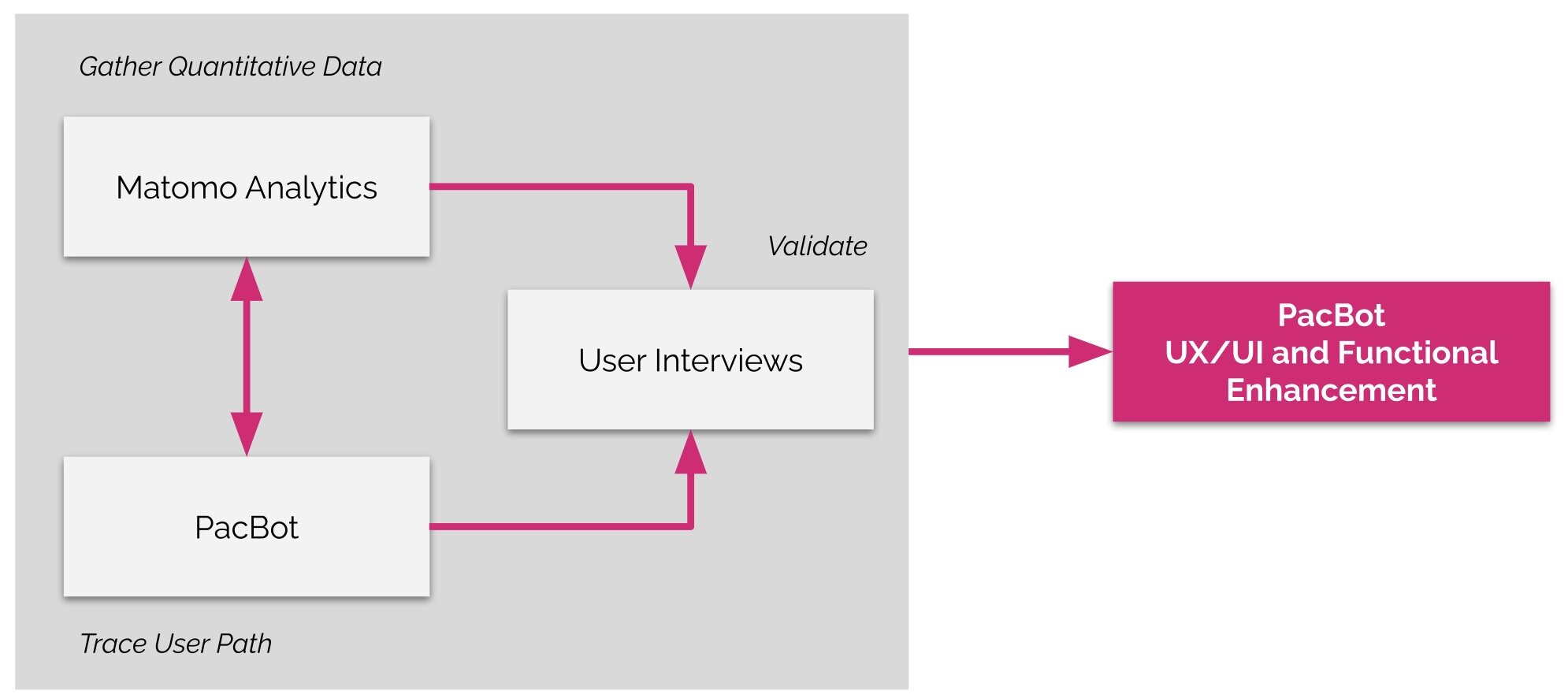 Design Research Strategy used for PacBot
Qualitative Interviews
To validate why users were going back and forth between two or more pages, the Product Manager from the customer side and I interviewed five users. We asked what they had been looking for, what motivated them to use PacBot, and what challenges they were experiencing.
We also asked them to show us how they used PacBot so we could observe their interactions with the interface. As it turned out, the Violations page — and PacBot as a whole — did not offer the ability to right-click a link and open it in a new tab or window. This forced users to click into the next page even when they weren’t intending to leave the Violations page.
That being said, users found themselves going back to the Violations page repeatedly. In some cases, they would download a list of violations, then bounce between the Violations page, the Violations Details page, and back again. From analytics, it could be seen that some outliers did this for an hour, since they had to resolve violations for the applications they owned.
Interestingly, none of the users we interviewed complained about the right-click, regardless of how tedious their browsing behavior looked from an observer’s standpoint. They did, however, mention that they were hunting for information. One user new to PacBot said there was a steep learning curve to familiarize themselves with the interface. This enterprise tool has at least 60 pages.
Key insights
Navigational path
- Users spend a minimum of 6 clicks to find the how-to / self-service instructions.
- Users are confused about which navigational path to follow.
Available information
- Users are overwhelmed with the amount of information presented.
- Some users know what information they are looking for; however, it is buried in subpages.
Web application performance
- Users were frustrated with the long generation time to load the Violations page.
- Links did not behave in a conventional way, forcing users to follow cues such as forward and back arrows.
Solution
Internally, I worked with a Visual & Interaction Design Lead, a Program Manager / Frontend Lead, and the UX Director. We brainstormed solutions based on the insights and worked closely with the customer’s Product Manager, Principal Architect, and other team members to get feedback and quickly iterate.
How might we…
…create a better navigational path from the Violations page to the self-service instructions?
Solution A: Create a right-hand drawer that acts as a shortcut to the Policy Details page outlining the how-to resolution. With this, we reduced the clicks from 6 to 3.
…present the information upfront?
Solution B: Organize the violations’ metadata based on the users’ search behavior.
…improve the users’ interactions with the application without making a major design change and with minimal effort to implement?
Solution C: Without backend support, focus on UI changes such as ensuring links have right-click options to open in a new tab or window.
Solution A · Simplifying the workflow
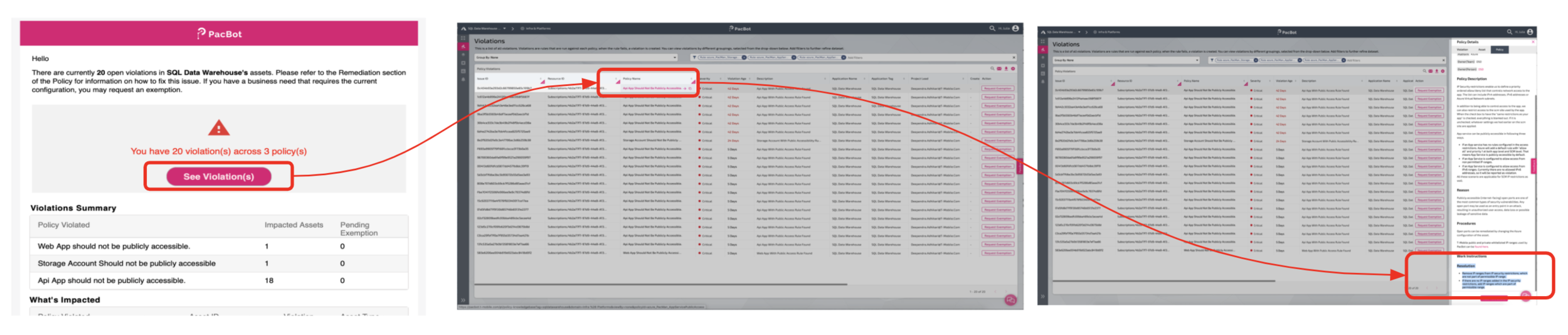 A straightforward path to self-service instructions
The new workflow allows the user to interact with the list of violations without leaving the page. The most important information about the violation, asset, and policy can be accessed on the same page by clicking the active links. This opens a right-side panel containing summarized information. Should the user need the full view, links can now be opened in a new tab or window, allowing the user to continue going through the list of violations.
Violations page redesign
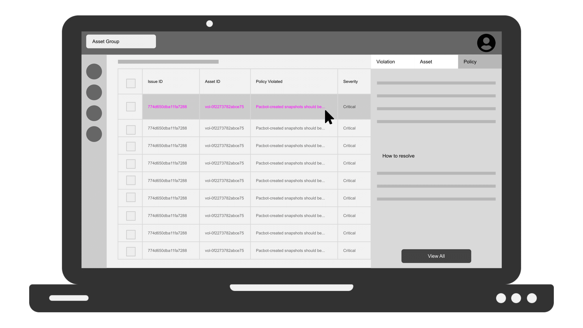 Low-fidelity design using Google Slides — inspired by Google Doc interaction design
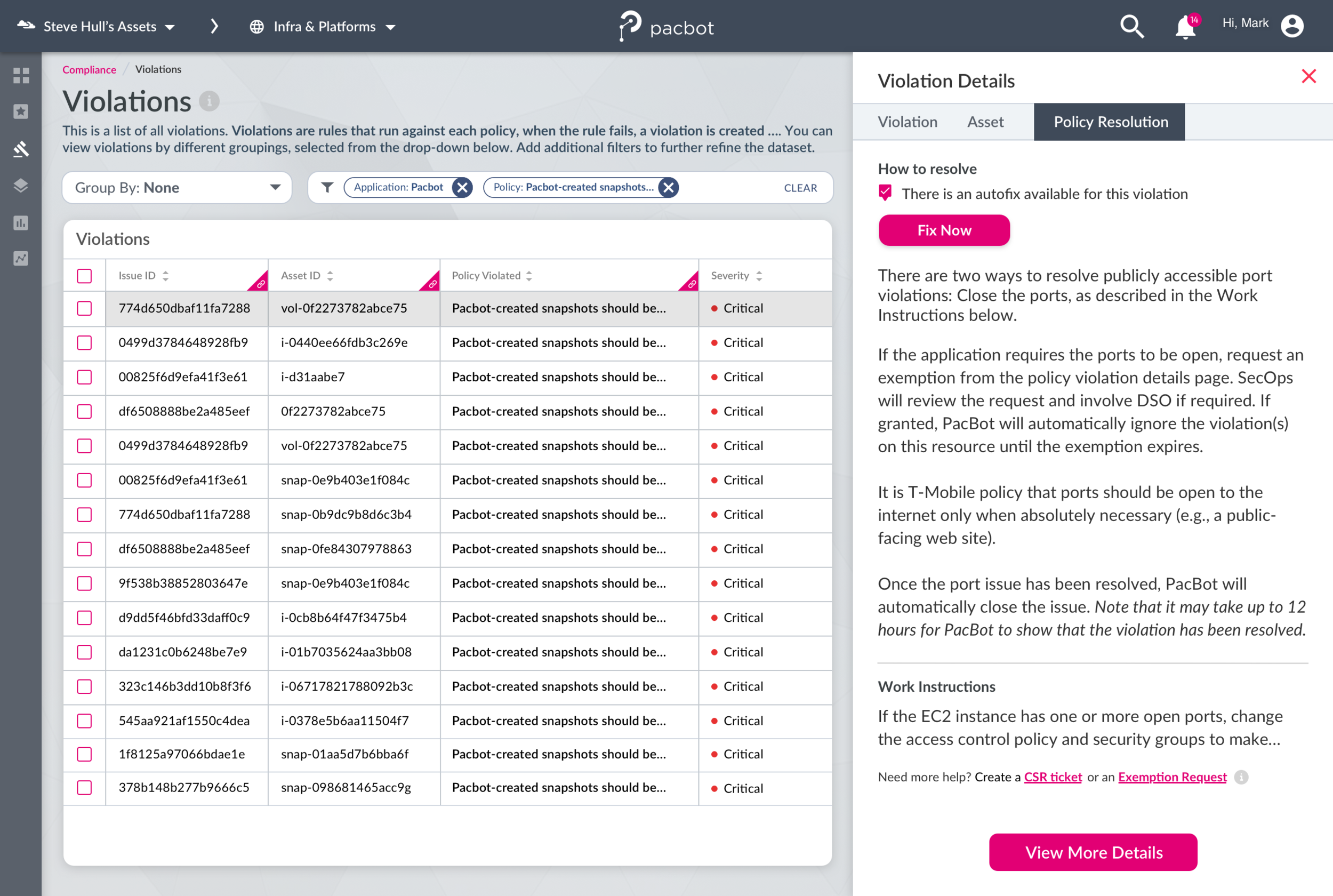 Final visual design of the Violations page
Since users need to identify the asset that violates a policy, violation, asset, and policy details are all accessible via the Violations page. This experience makes it easier for the user to find information. For users who need the self-service instruction, they can find it by clicking the third ‘Policy’ tab, which opens the side panel.
In addition to the step-by-step instructions, the ability to request an exemption is also available upfront on the Violations page.
Solution B · Changing the logical order of table information
The metadata in the violations list contained 23 values and was not in a logical order. We restructured the order after conducting a UX audit and interviewing users to learn which information was important to them.
| Previous metadata (23) | New metadata in logical order (19) |
|---|---|
| Issue ID · Policy Name · Resource ID · Asset Type · Severity · Rule Category · Action [float] · Created on · Modified On · Account ID · Account Name · Description · Region · Status · Application · Environment · | Issue ID · Resource ID · Policy Name · Severity · Description · Application Name · Application Tag · Request Exemption · App Project Lead · Account Name · Created on · Account ID · Asset Type · Region · Environment Tag · |
Solution C · Enabling right-click to open a new tab or window
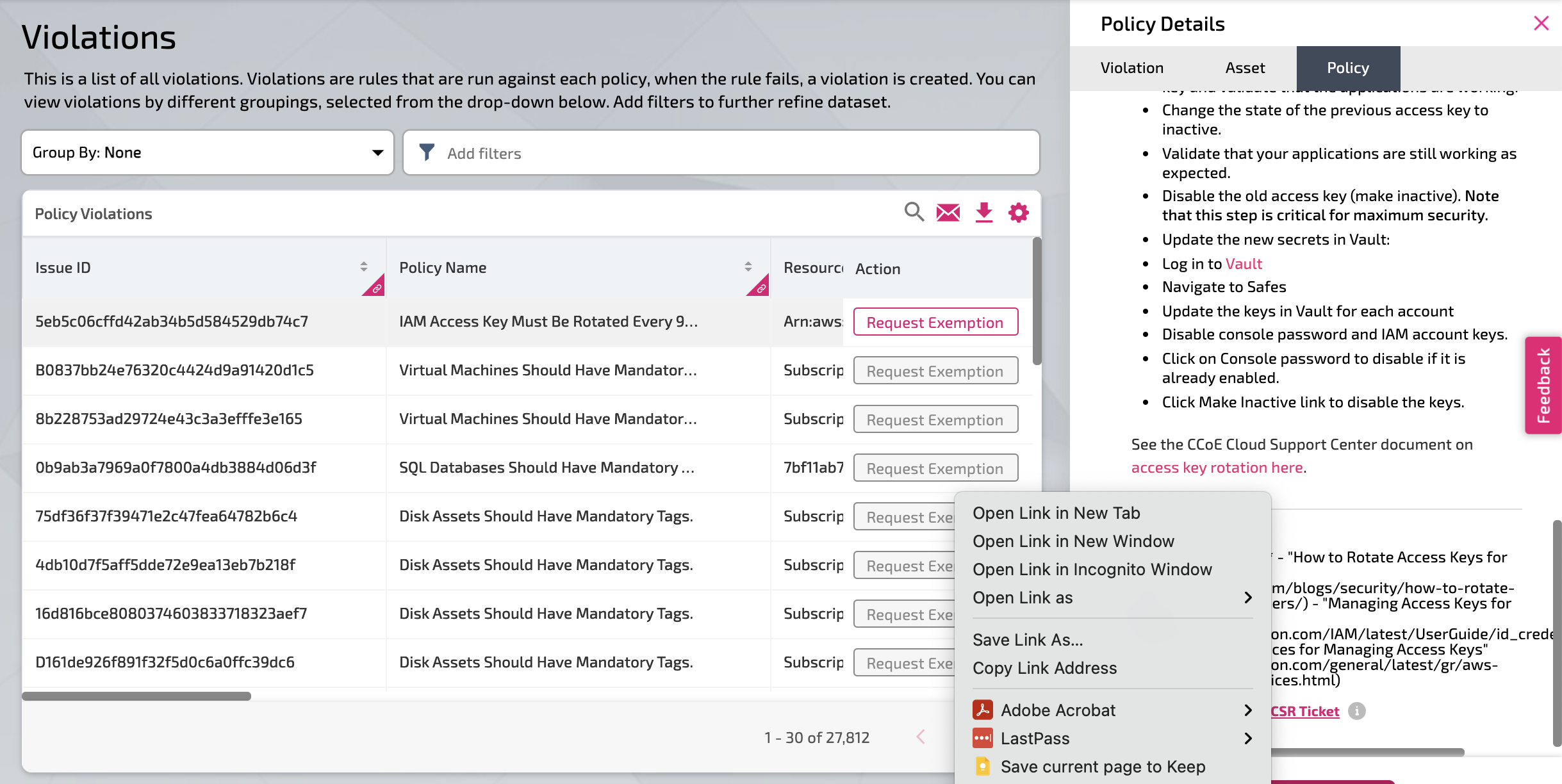
PacBot was built using Angular with NodeJS. There was complexity in implementing right-click with options to open links in a new tab or new window. This significantly impacted users’ behavior. While interestingly none of the users we interviewed complained about this, analytics showed that the back-and-forth between multiple pages resulted in many logged actions.
Bonus · Email notification
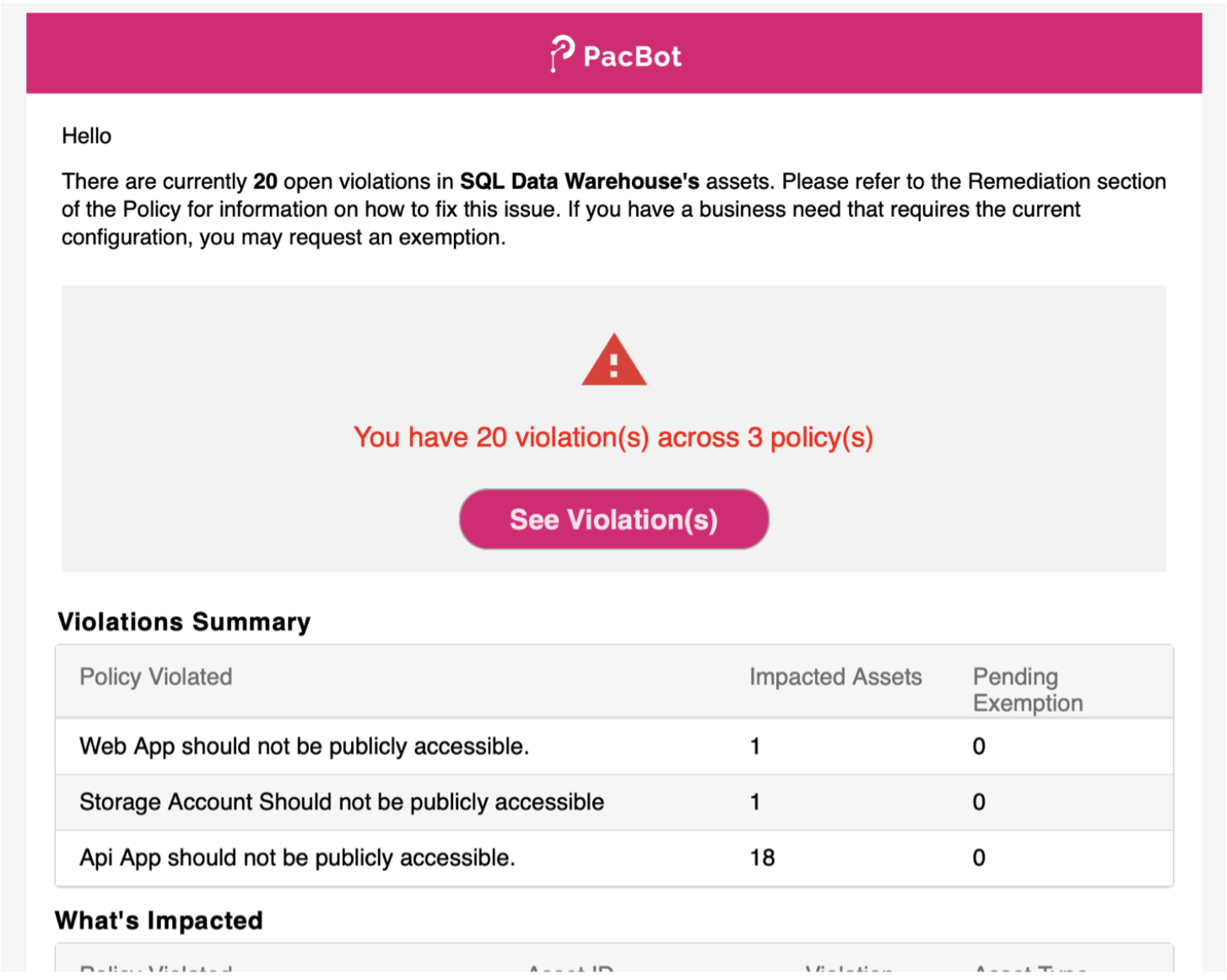 PacBot email alert
Previously, users received email alerts of violations that took them to a list of violations without a corresponding filter. As part of the design solution, the call-to-action button from the email notification now takes the user to a pre-filtered list of violations specified.
With these solutions, we developed an enhanced workflow that provides information upfront, reduced the overall generation time, and positively improved the experience of users when interacting with the PacBot interface.
Results
The redesign of the Violations page successfully eliminated the pogo-sticking behavior between the Violations page and the violation / policy / asset details pages.
- Page views of the Violations page reduced by 50% — from an average of 3,000 to 1,500.
- Visits to the Policy Details page (which contains the self-service instructions) increased by 7%.
- Actions within the Violations page significantly decreased, while engagement (time spent) remained the same.
In the post-mortem review, we found that users were more productive with the new interface — taking fewer actions while remaining equally engaged.
Reflections
The team created an impactful change in how users interact with the PacBot interface. Personally, I am very pleased with the outcome — not only because we made the customer happy, but because most enterprise products are challenging to design. The complexity of managing a gargantuan amount of data and the level of technicality is often used as an excuse for why these products do not have good usability compared to consumer products.
When I onboarded to this project, my design principle was less is more. That’s why the solutions did not involve a massive design overhaul, but leveraged existing pages to create a better navigational path. Going back to basics by introducing the ability to right-click (which should have been there in the first place) was its own feat, given the technical limitations.
Lastly, on the research methods used: I would ideally start with qualitative interviews and then validate the words against the patterns. However, the problem here was discovered while reviewing the metrics. High page views and time spent do not immediately mean that a page is performing well. It depends on the purpose of the application and users’ behavior. Users in PacBot are not encouraged to wander around — they are very intentional. That is why it is critical for them to go in and out as quickly as possible, but armed with the correct information to take action outside the interface.
To learn more about PacBot and view some of the old designs, visit the T-Mobile PacBot GitHub page.