Case study
Elliott Bay Book Company
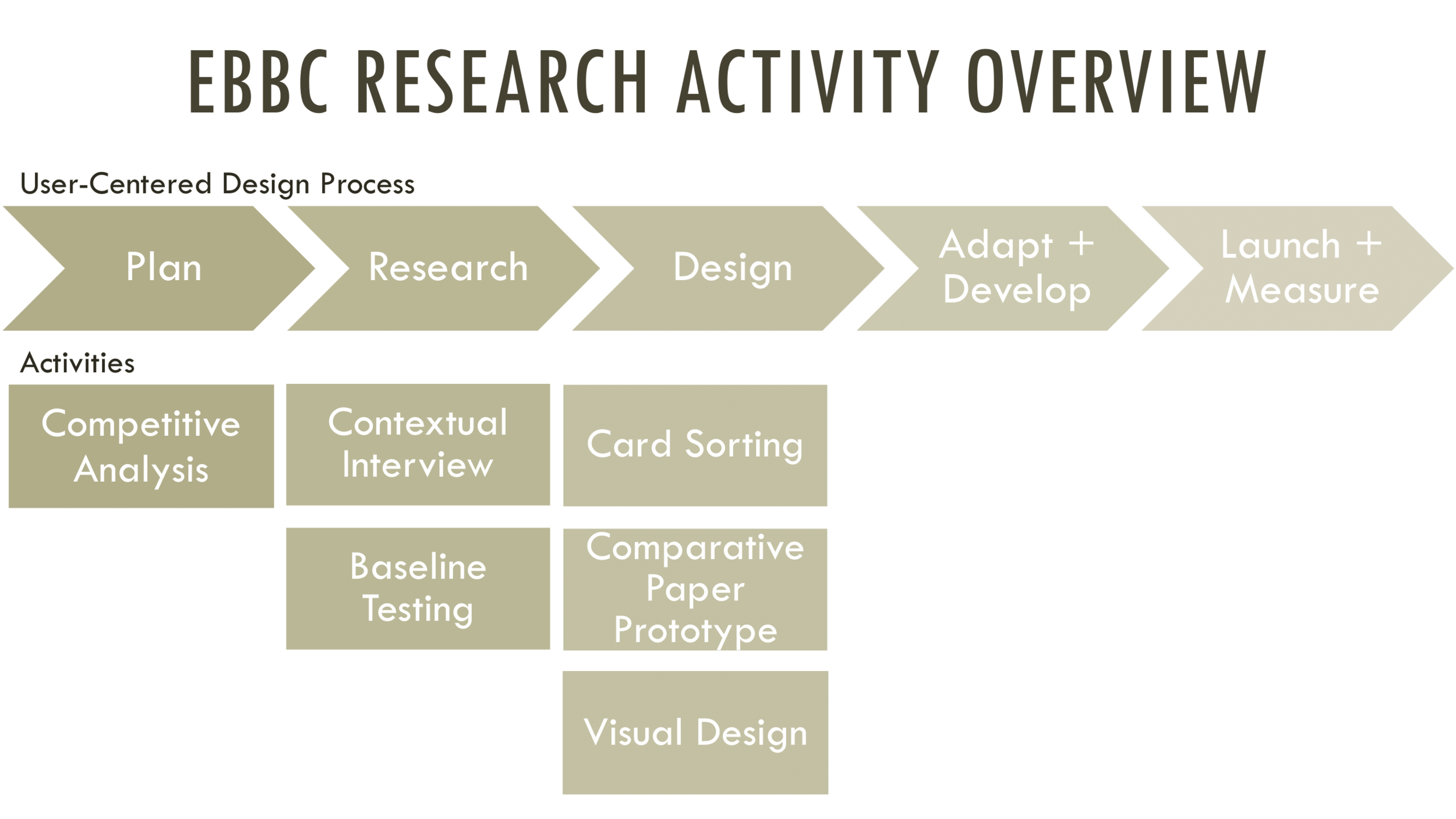
Redesigning the website for an independent Seattle bookstore using a full user-centered design process — competitive analysis, contextual interviews, baseline testing, card sorting, and comparative prototypes.
- Organization
- Elliott Bay Book Company (school project)
- Role
- UX Researcher · UX Designer
- Team
- Two students
- Year
- 2017
Overview
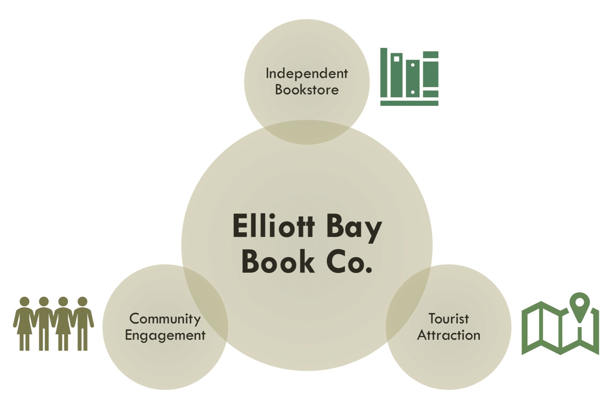
Elliott Bay Book Company (EB) is an independent bookstore in Seattle. It continues to thrive despite the increasing growth of the buying and selling of electronic books. This is because of the unique experiences they offer to their customers — community events, an in-store coffee shop, and an interior that draws tourists as much as locals.
This was a three-month school project. Our two-student team was tasked with conducting a variety of user research methods throughout a web design or redesign process. I significantly contributed to Competitive Analysis, Baseline Testing, Card Sorting, and Visual Design.
What is User-Centered Design?
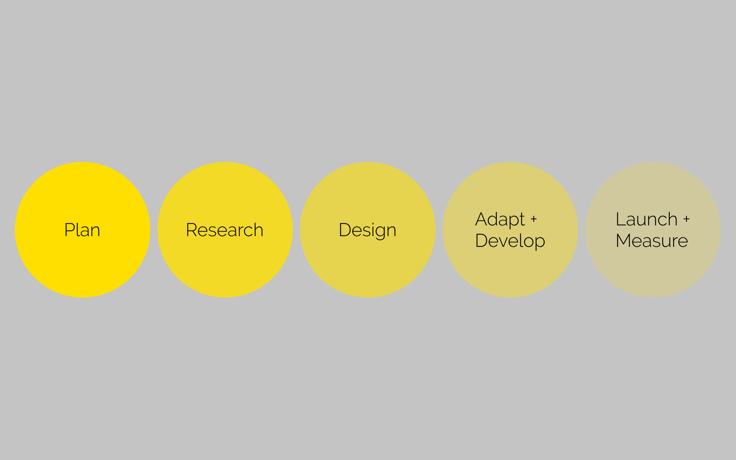
UCD is a process that aims to achieve good user experience by giving extensive attention to usability goals, user characteristics, environment, tasks, and workflow of a product, service, or process at each stage of the design process.
User research methods
#1 Competitive Analysis
What was the purpose? We conducted a competitive analysis as preparatory research. The methodology lets you evaluate the strengths and weaknesses of competitors before you commit to a design direction.
What actions were taken?
- Selected two competitors with similar business DNA, target audience, popularity, and location in most-visited US cities.
- Compared business performance using DemographicsNow.
- Read reviews on Yelp and Google.
- Compared the UI design, features, and best practices.
- Evaluated strengths and weaknesses.
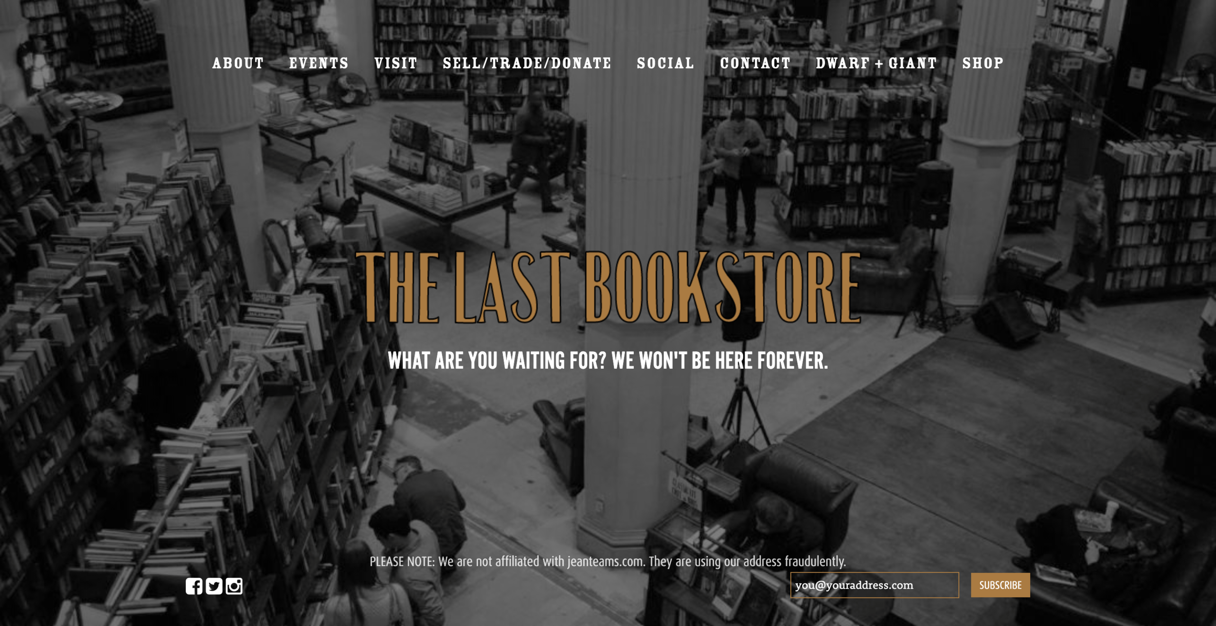
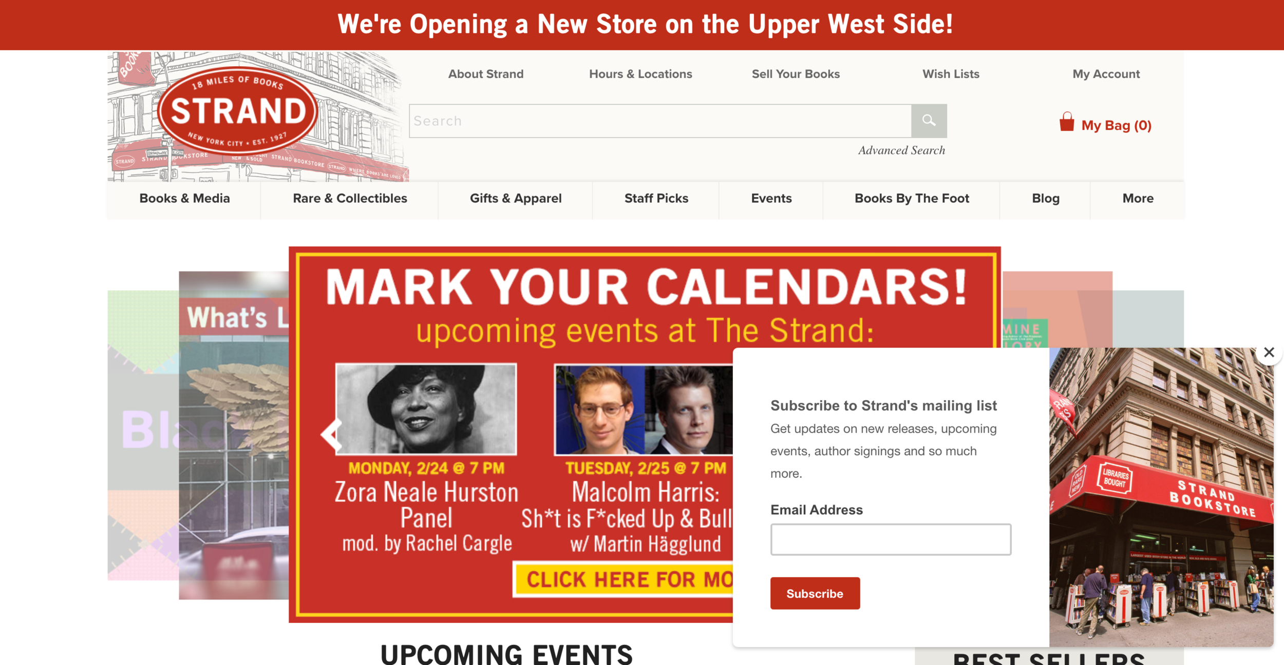
Findings and recommendations
- From a business standpoint, Strand Bookstore (SB) in New York generated more revenue, followed by EB, then The Last Bookstore (LB) in Los Angeles.
- In terms of popularity, Strand was the most-visited bookstore.
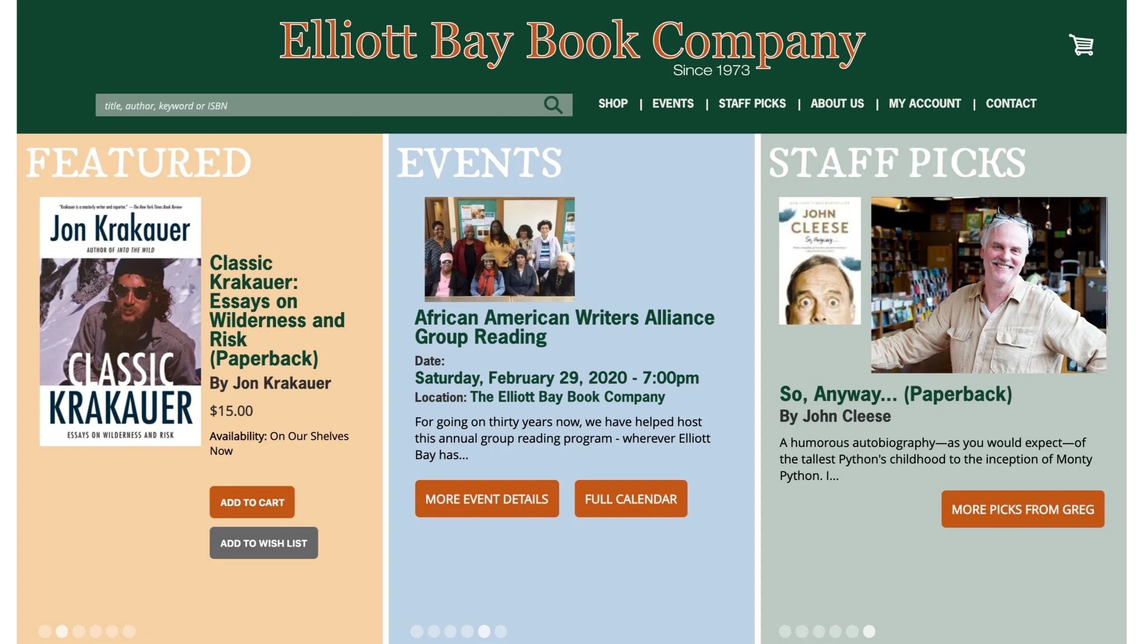
- SB and LB used clearer labels and taxonomy. EB needed better information architecture and more informative labels.
- Book categories could be easily spotted in SB and LB. EB needed to create them.
- Unlike SB and LB’s events page with a calendar of events, EB populated its event page using books as a primary element — confusing. EB needed an event page where event information is instantly visible.
What we would do differently. We would consider changing the variables in selecting competitors — perhaps bookstores located in the same city and established in the same timeframe. We remained curious about what motivated customers who would prefer to visit Twice Sold Tales over EB.
#2 Contextual Interview
What was the purpose? To validate our observations from the Competitive Analysis and to better understand customer behavior.
Our objectives:
- Know what type of people go to Elliott Bay Book Company.
- Know how users use the EB website.
Approach. Prepared interview questions using the AEIOU framework (Activities, Environments, Interactions, Objects, Users). Intercepted bookstore visitors on-site and reached out to students who wanted to participate. Recorded the interviews and took notes on the highlights.
Findings. The four customers we interviewed on-site and the two students liked:
- The ambiance of the bookstore
- Their interactions with the staff
- The bookstore as a place to hang out with friends
- The memories they had in the bookstore
The majority did not use the EB website — they preferred the in-store experience. Those who attempted using it found it frustrating and difficult to use.
Come for the books, stay for the experience.
It became obvious that customers enjoy visiting the bookstore not only because of the books but because of the experiences they offer. This led us to consider browsing travel websites. What if we redesigned EB’s website not only as an online retail shop, but as a destination? Since customers loved the staff picks, how do we make staff picks more visible to increase sales? And since events are one of the main reasons people visit, how do we improve the usability of the event page to increase store traffic?
#3 Baseline Testing
What is it? The baseline test is a methodology used to evaluate the website’s current performance by gathering quantitative and qualitative data.
What we did:
- Prepared a baseline test script, scenarios, and tasks.
- Developed a Key Performance Indicator (KPI) plan.
- Observed participants’ interaction with the website.
- Gathered and analyzed data.
- Success rate: on average, 57% (3 out of 5 participants) failed in achieving a satisfactory result for completing each task.
- Failed distribution: of the 3 who didn’t achieve a satisfactory rating, 2–3 were unable to complete the task within the time limit, and 1–2 gave up entirely.
- Error count: participants made mistakes when using the search bar to look for information — a major driver of the high failure rate.
Given the high failure rate, I insisted we go back to our first impressions — redesign the information architecture, use clear labels, and improve the taxonomy. That led us to the card sorting activity.
#4 Card Sorting
Why? Card sorting generates a category tree or taxonomy to improve information architecture, workflows, menu structure, and navigation paths.
How:
- Created groups and cards using OptimalSort.
- Asked 10 participants to group the cards.
- Asked supplementary post-questions.
- Gathered and analyzed data.
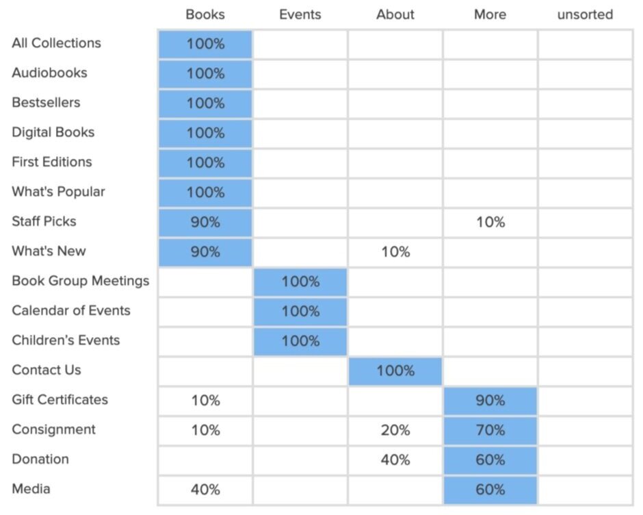
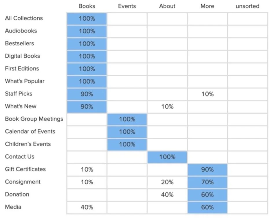
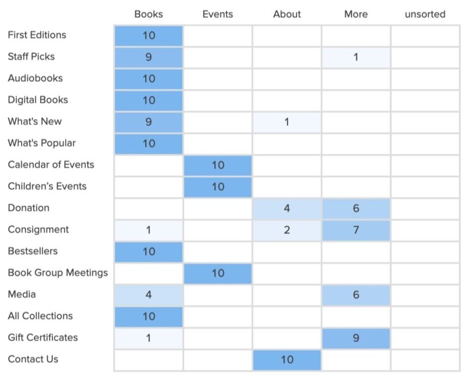
Based on the collective results, categories arranged logically as Books, Events, About, More.
- 90–100% of participants placed eight cards under Books (All Collections, Audiobooks, Bestsellers, Digital Books, First Editions, What’s Popular, Staff Picks, What’s New).
- 100% chose Book Group Meetings, Calendar of Events, and Children’s Events under Events.
- Only Contact Us had clear consensus under About.
Actions we considered:
- Separate Books from other Media. Many participants felt there were too many cards under Books — Audiobooks, Digital books, CDs, DVDs would be cleaner in a separate Media category.
- Add Programs to the navigation (Book Consignment, Book Donations, Maiden Voyage).
- Rename and shorten labels: What’s New → New Releases, What’s Popular → Popular Now, Digital Books → eBooks, Calendar of Events → Calendar.
- Place Gift Certificates strategically in a secondary navigation.
Closed vs Open vs Hybrid card sort. We repeated this activity. The first attempt was a hybrid card sort that confused participants — everyone seemed to create a new category, making it difficult to analyze. We switched to a closed card sort so they could focus on grouping the cards.
#5 Comparative Paper Prototype
A paper prototype is a low-fidelity wireframe made with pen and paper, used to test user interfaces quickly and economically. We created two designs and compared them to test which was more usable.
The original paper prototype demonstration is a video — not yet re-hosted in this archive.
It was really fun. We found a new appreciation for using pen and paper in creating prototypes — ideas flow freely and the folding of papers became a nice trick for transitioning between pages. Personally, I always keep a pen and paper. Each time I have an aha-moment, I sketch my ideas.
Iterative design
User-Centered Design is iterative. A user insight becomes a design insight. We took everything from the research above and turned it into wireframes, then into two hi-fi visual directions to test which one users preferred.
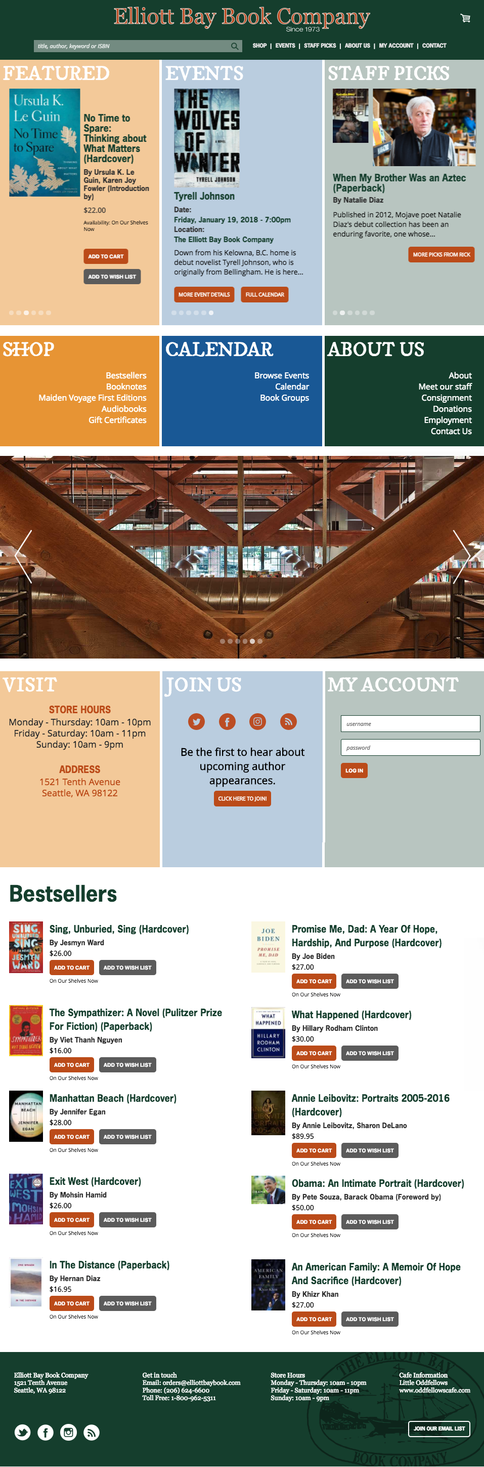
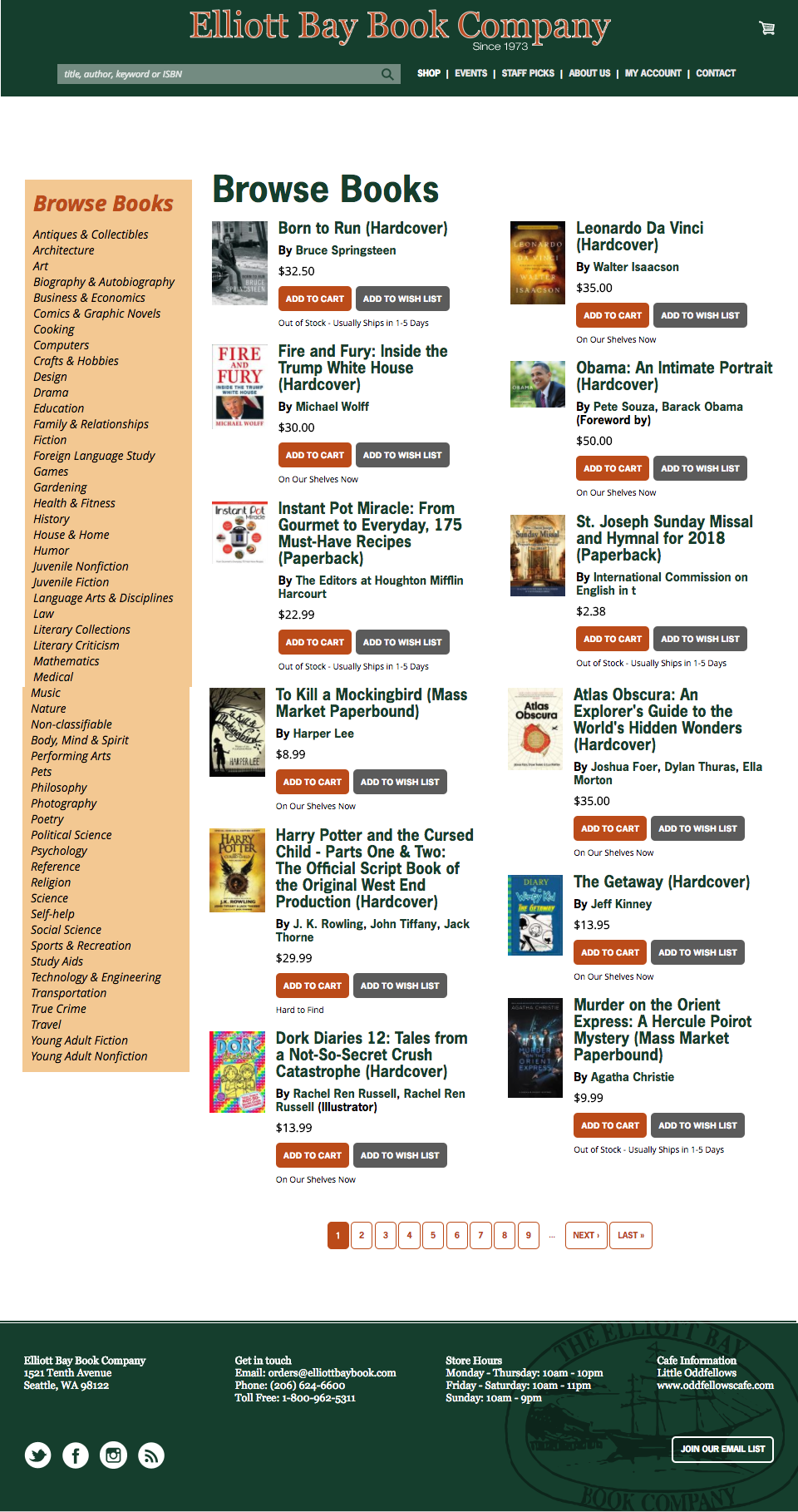
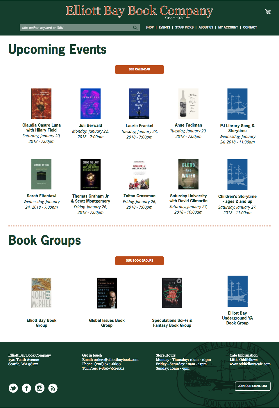
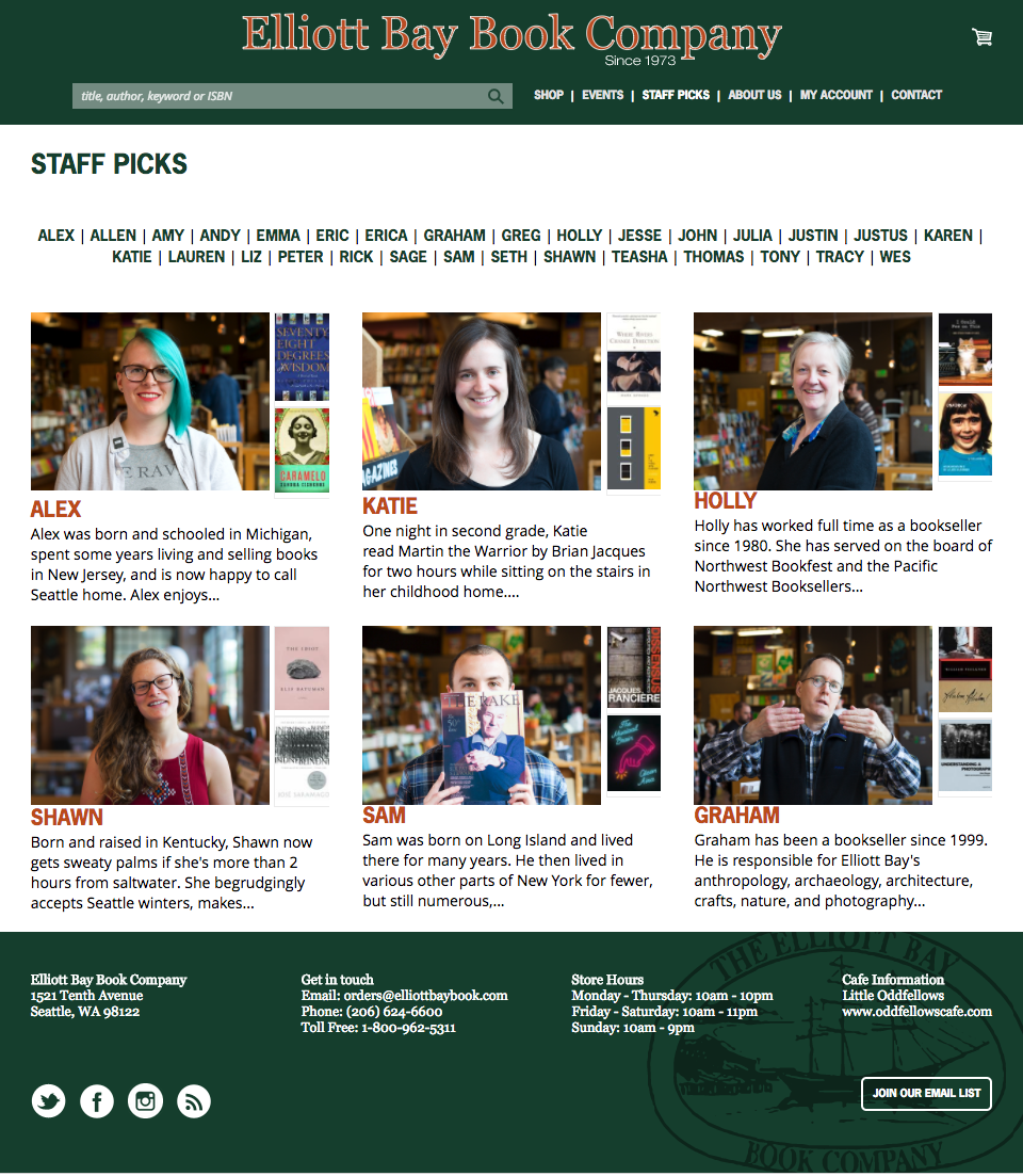
The existing site (before)
For reference, this is what the existing EB site looked like before the redesign — the starting point for the baseline test.
Home page
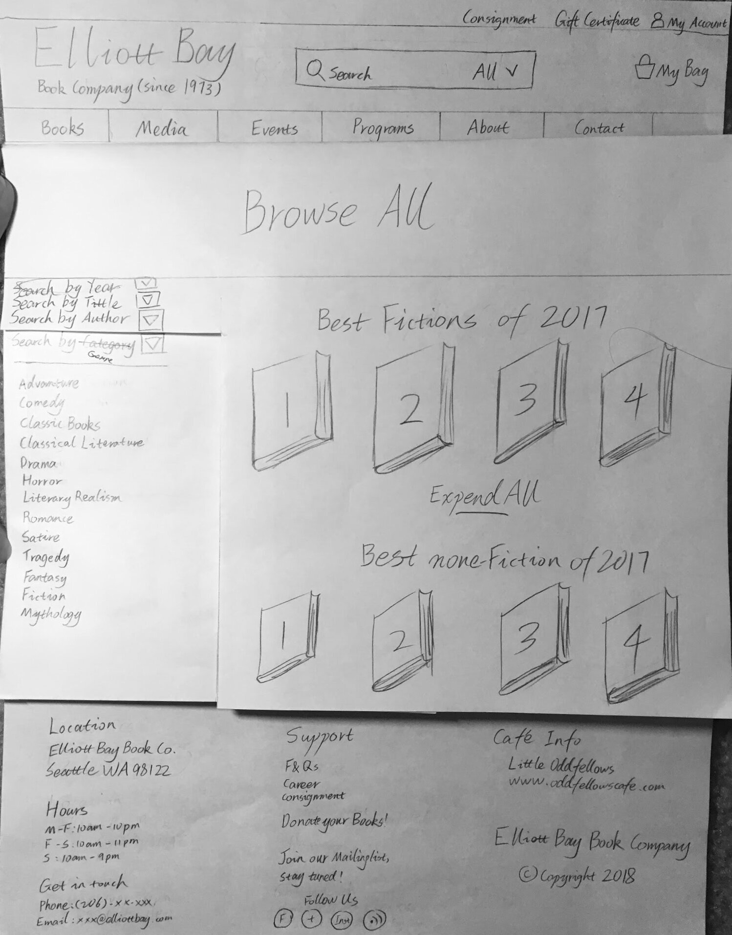
We created two low-fidelity prototypes and combined them.
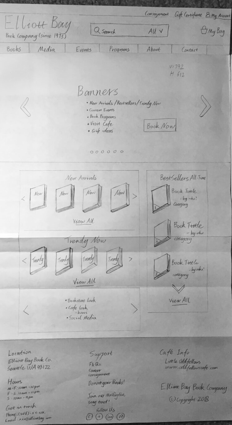
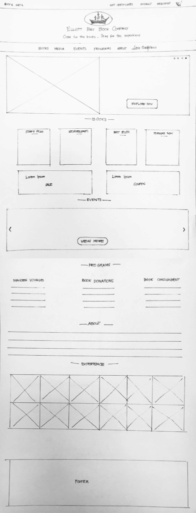
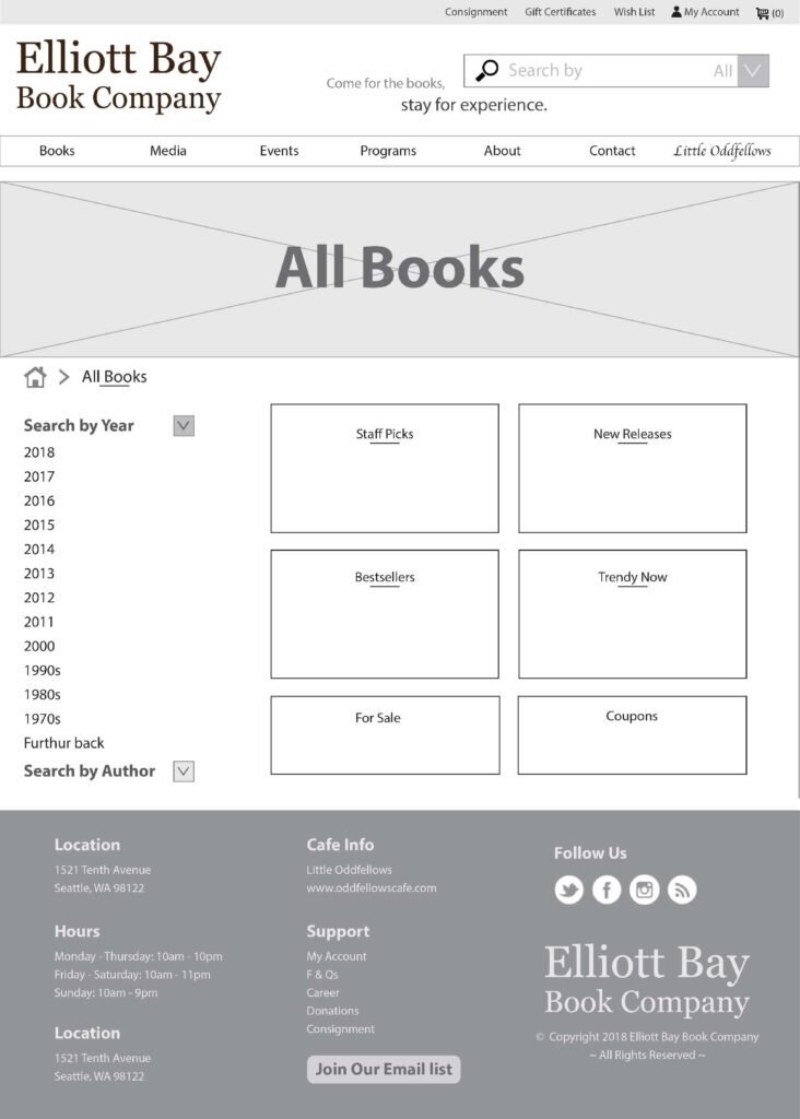
We then moved to a mid-fidelity exploration before committing to the hi-fi direction.
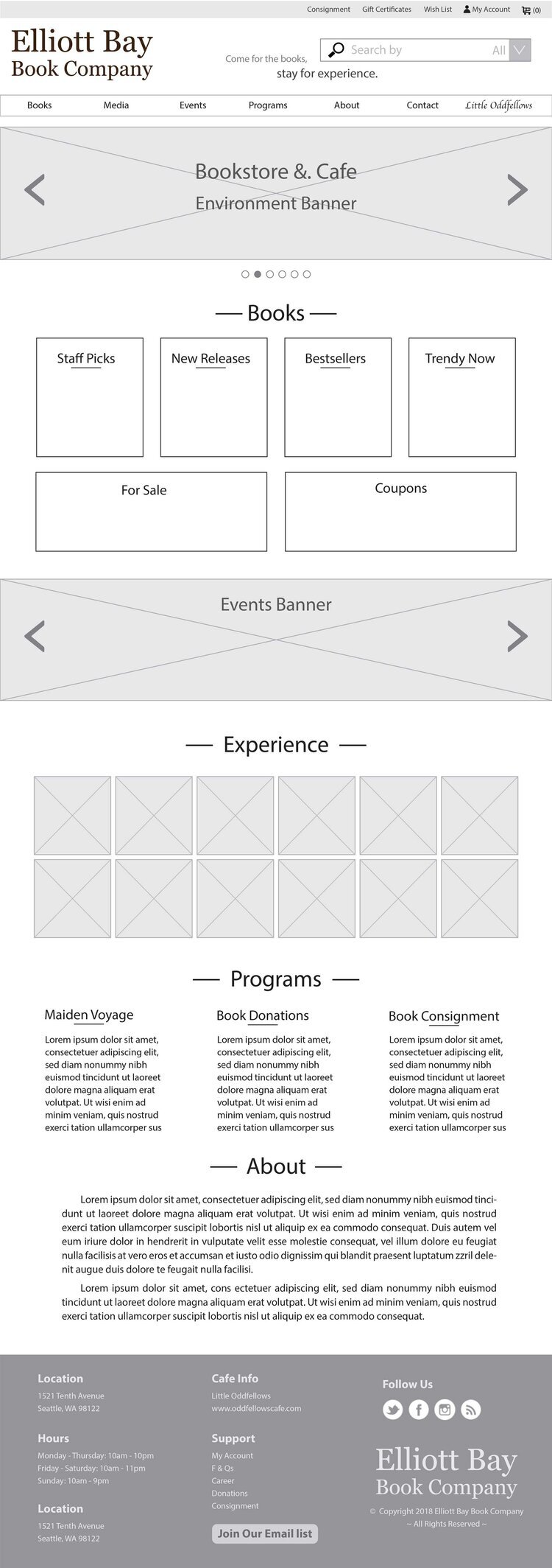
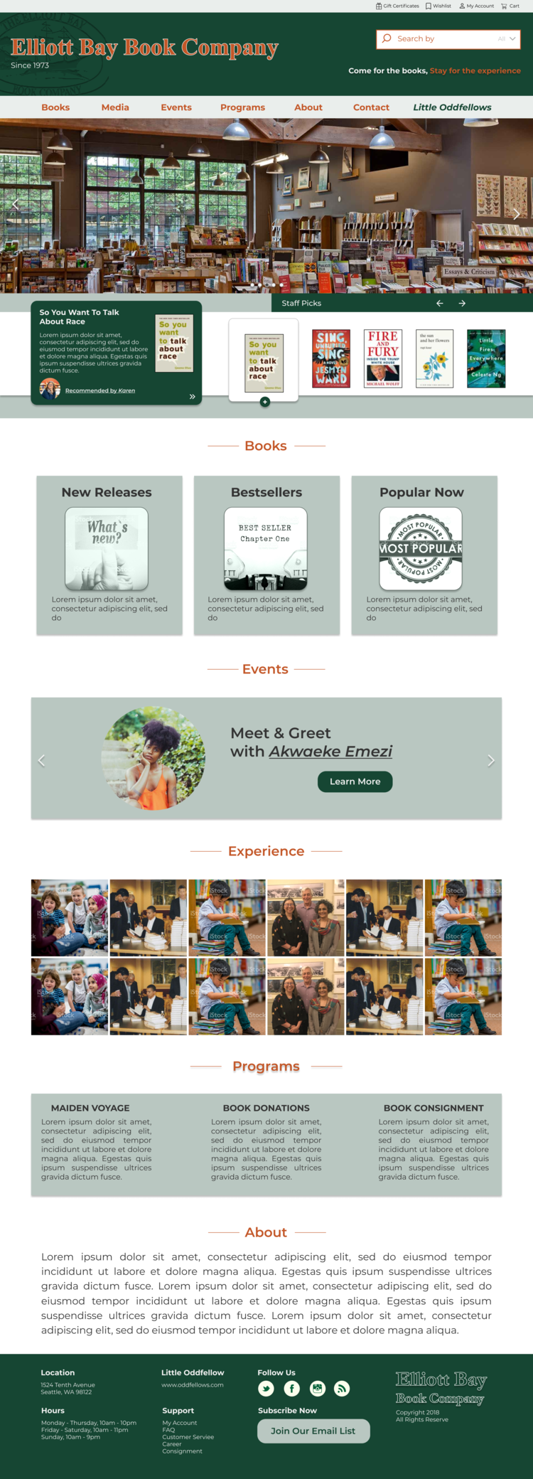
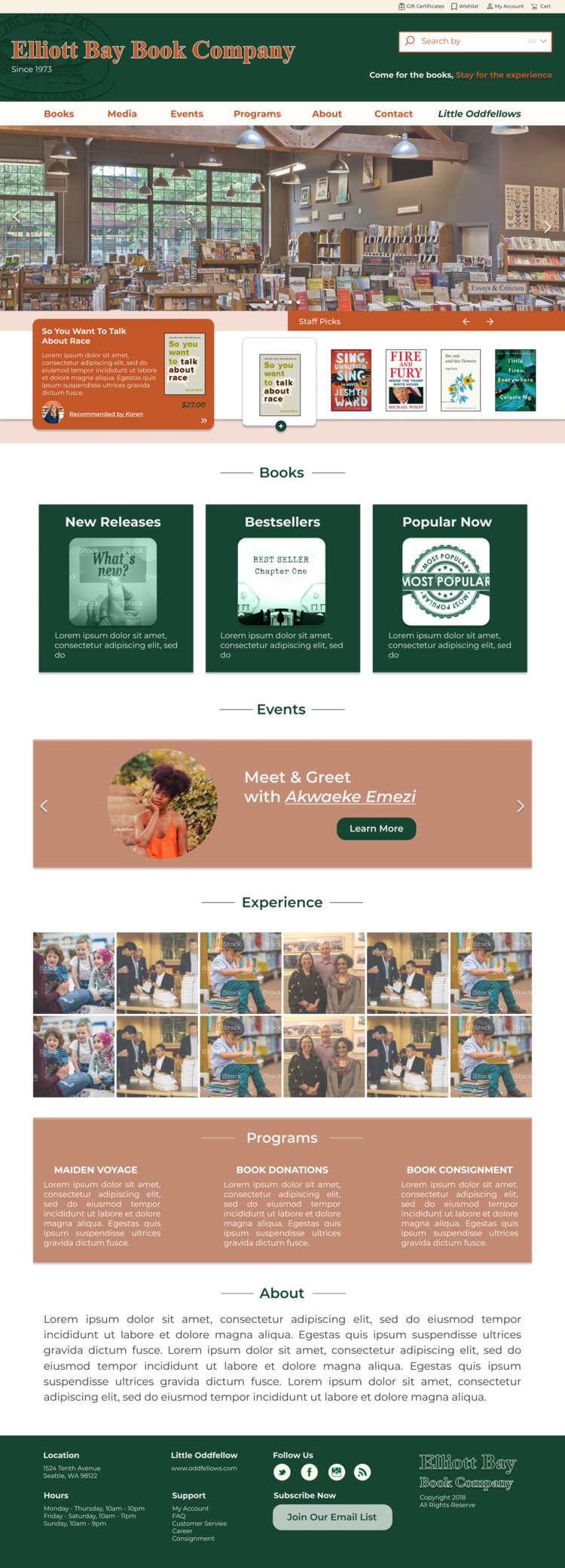
For the high-fidelity prototypes, we created two versions — one cool-toned, one warm-toned — and chose the one preferred by users.
Cool palette
Warm palette
Books page
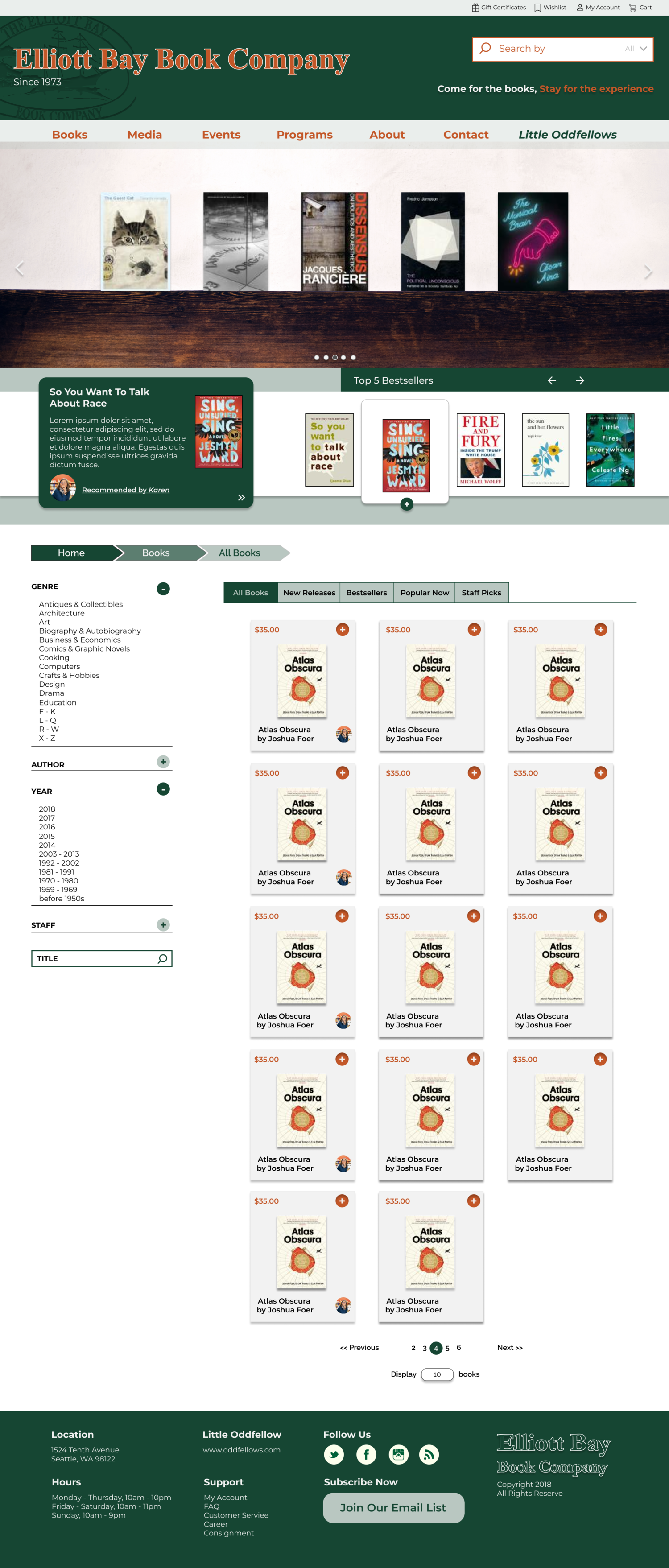
To simplify the books category, Staff Picks was merged into Books. When we conducted the baseline test and card sort, most participants placed them under Books anyway.
Staff Picks
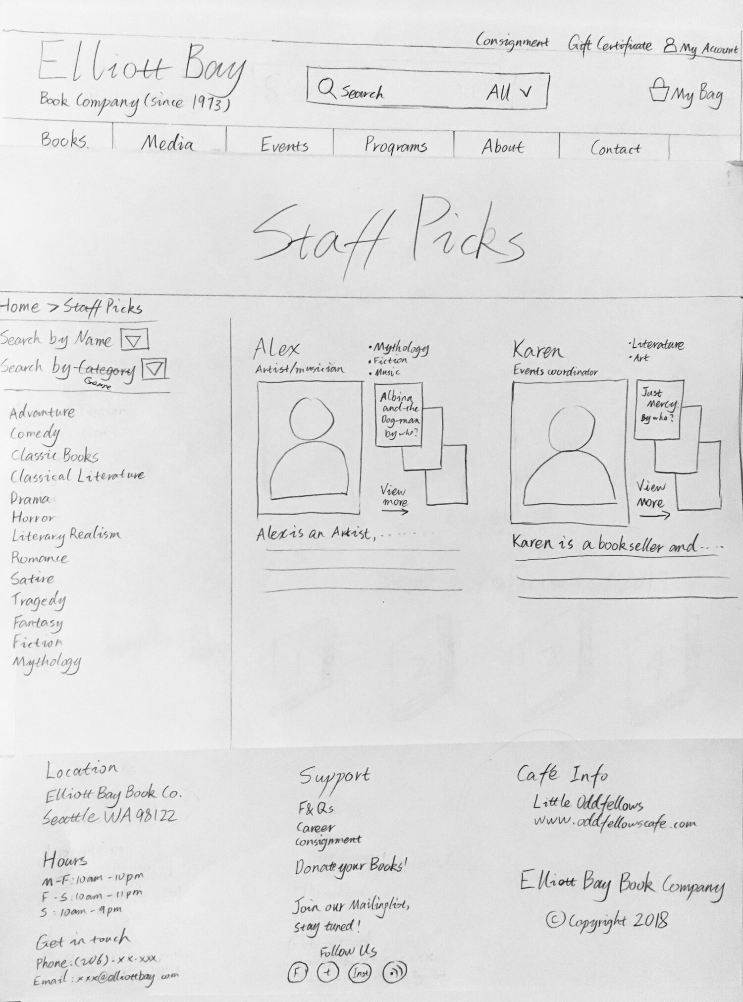
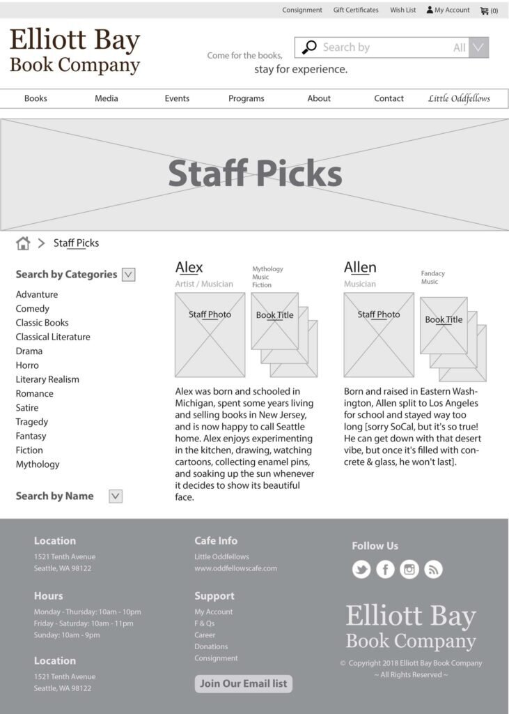
Staff Picks were a recurring theme in interviews and card sorting — customers loved them. We prototyped a dedicated experience before ultimately merging it into Books.
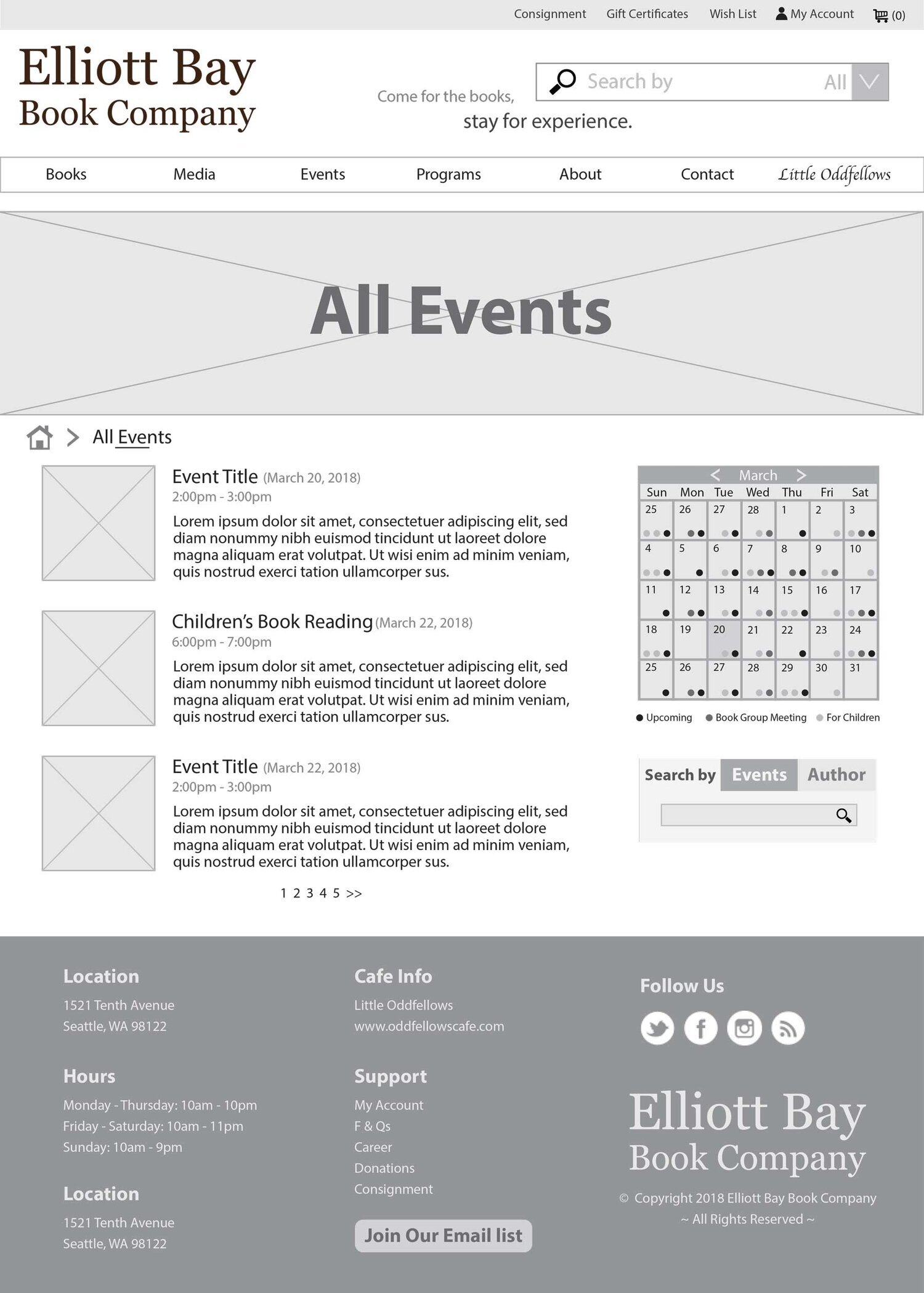
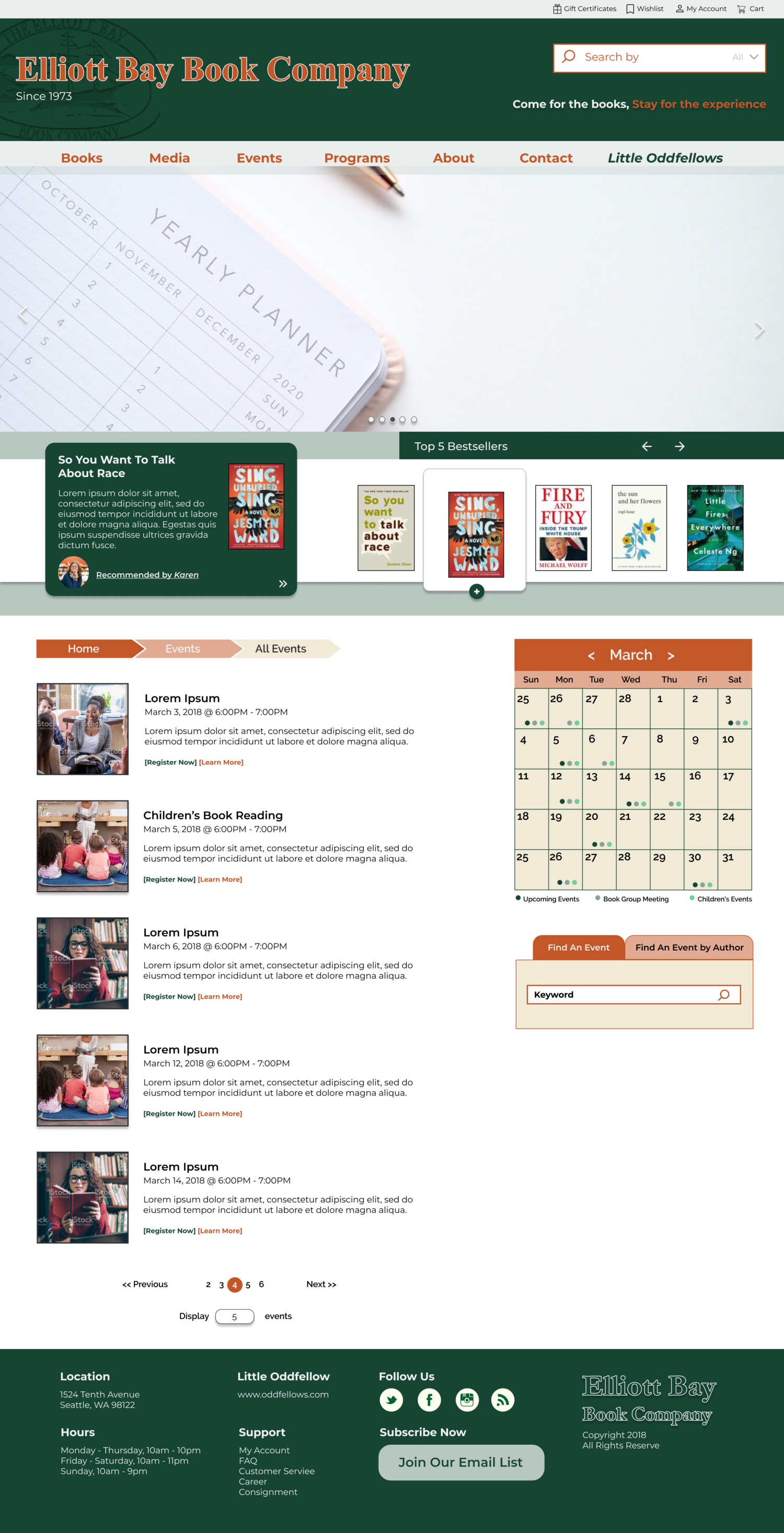
Events page
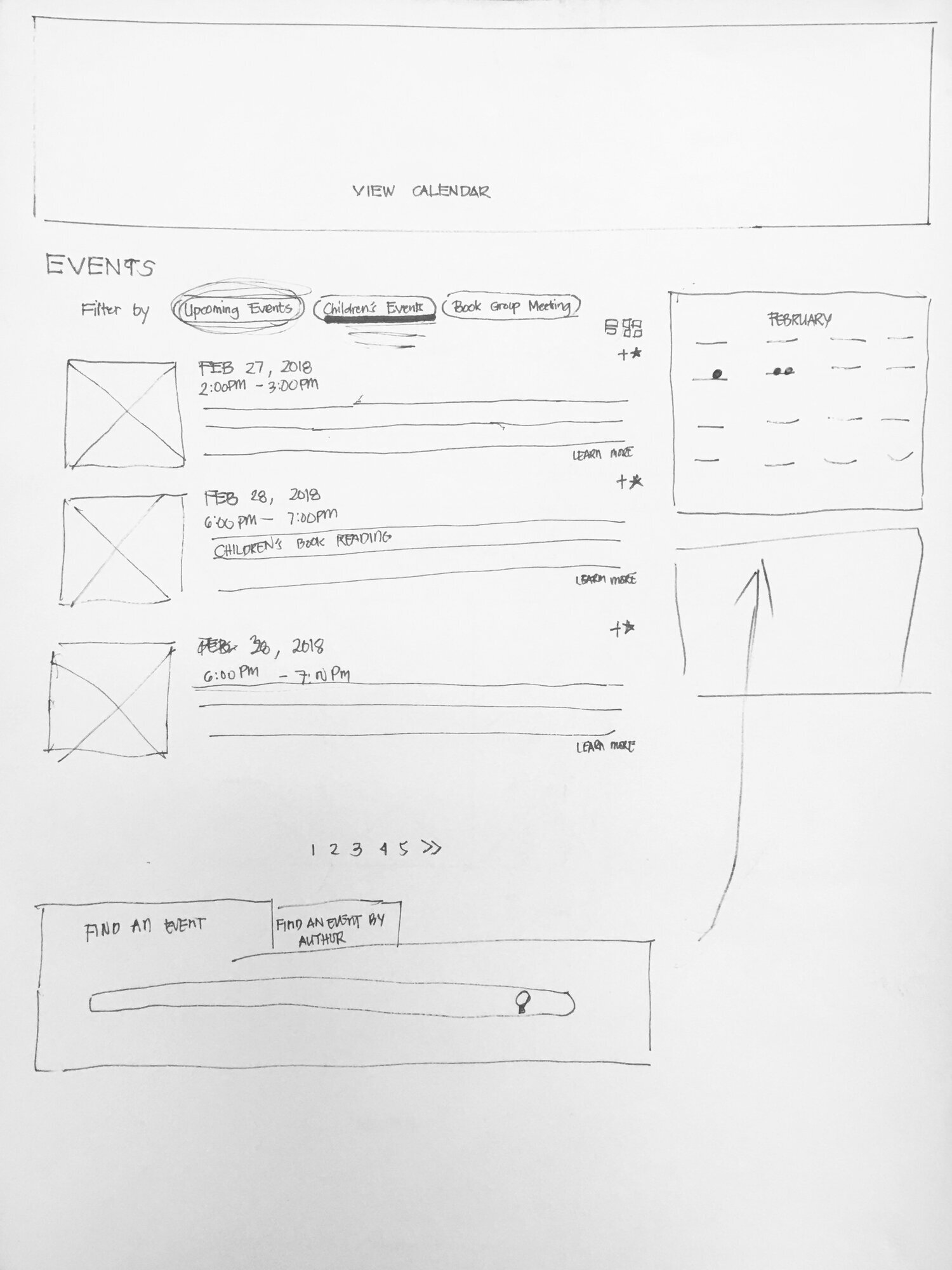
Events were crucial to EB. Their existing interface was confusing — confirmed by the high failure rate during the baseline test.
Conclusion
The design with a cooler tone was chosen as the final direction. Considering the time constraint, I was able to complete the redesign of the home, books, and events pages. A gargantuan effort was allocated for the redesign of the information architecture.
Borrowing inspiration from travel and destination websites, the home page features a fullscreen image of the bookstore interior. We also incorporated staff picks as a global element of the header — visible across all three pages.
Reflections
There is great value in following a UCD approach, especially in reconciling the gap between the business and the users. As a designer, I learned to look at each design challenge from the lens of the users.
For this particular project, I would have loved to learn more about the bookstore’s business goals and identity. And if the redesign was implemented, it would be great to measure performance — is there an increase in new visitors? Incremental growth from online shopping? More traffic to the website?
After conducting a variety of user research methods, I found a new appreciation for truly empathizing with users and using insights to implement a design.